
CSS and Round Corners: Build Accessible Menu Tabs Article

One of the best Websites out there, in terms of functionality, is Amazon.
In terms of accessibility, though, it’s not great.
Key Takeaways
- CSS can be used to create accessible menu tabs with rounded corners, improving the user experience for those with poor vision or who use screen magnifiers.
- The process involves using HTML and CSS to create the menu tabs, adding left and right corner images to the tabs, and adjusting the padding to ensure text does not overlap the rounded corners.
- The created menu tabs can be made accessible to those who disable CSS by placing the tabs into a list, using CSS rules to display the tabs inline and make the entire tab clickable.
- While this method has limitations in older browsers like Netscape 4 and IE 4, an external CSS document called up using the @import directive can be used to circumvent these issues.
The Problem
Amazon’s menu tabs, with their nice round corners, look good — but they’re totally inaccessible. First of all, they’re missing ALT tags. Additionally, the W3C accessibility guideline 3.1 (priority 2) clearly states:
When an appropriate markup language exists, use markup rather than images to convey information.
This basically means that we shouldn’t use images to display text. Users with poor vision are unable to resize text that’s displayed through images. Similarly, users of screen magnifiers may be unable to read text embedded in images, as it can appear blurry and pixelated to them.
The Solution: CSS Menu Tabs
CSS, as usual, comes to our rescue. Look at this menu tab, created through HTML and CSS — not an <img> tag in sight!
Have a look at it in action — when you do, adjust the text size in your browser. Notice that the menu tab increased in size with the text: it all fits perfectly.
Today, you’re going to learn how to do this.
How It’s Done
We start with a simple link:
<div id="navigation"><a href="#">Home</a></div>We’ll assign it this CSS code:
#navigation a

{

color: #000;

background: #fb0;

text-decoration: none

}


This gives us the following result:


It needs a bit of work, right? Let's do it.

Add the Left Menu Tab Corner

We need to make a small image with the same colour for the rounded left-hand corner. Here's one I made earlier.


Let's call this image left-tab.gif and place it into the background of the link using this CSS rule:
#navigation a

{

color: #000;

background: #fb0 url("left-tab.gif") left top no-repeat;

text-decoration: none

}
This new CSS rule says that the background image should be left-menu-tab.gif, the image should be on the left at the top, and it shouldn’t be repeated. The result?
We’re getting there, but we need to move the text over slightly as it’s overlapping the left rounded corner. It’s pretty simple to reposition the text with the addition of padding to our CSS rule:
#navigation a

{

color: #000;

background: #fb0 url("left-tab.gif") left top no-repeat;

text-decoration: none;

padding-left: 10px

}
The Right Corner
We can only assign one background image to a CSS rule, so we need to make a new CSS rule and assign the right corner image to that. We’ll start by inserting a <span> tag into the HTML code:
<div id="navigation"><a href="/"><span>Home</span></a></div>Now we’ll create a new CSS rule in which we’ll assign the right menu tab shown below (another one I made earlier) to the <span>, and we’re ready to go!
We’ll name this image right-tab.gif.
#navigation a span

{

background: url("right-tab.gif") right top no-repeat;

}
This CSS rule means that every <span> tag within an <a> tag will have this image as its background. The final result looks like this:
Perfect… No, wait a minute! Can you spot why it’s not so perfect? We forgot to assign some padding to that <span> tag in the CSS rule:
#navigation a span

{

background: url("right-tab.gif") right top no-repeat;

padding-right: 10px

}
This code gives us:
Now, that really is perfect! Have a look at the results here and resize the text to see how it looks.
The Final CSS Touches
Let’s assign this link a nice hover effect using a few final CSS rules. We’ll need a couple more background images:
We’ll call this left-tab-hover.gif.
This one’s named right-tab-hover.gif.
Now, we just insert the following CSS rules, and away we go!
#navigation a:hover {

color: #fff;

background: #fb0 url("left-tab-hover.gif") left top no-repeat;

text-decoration: none;

padding-left: 10px

}


#navigation a:hover span

{

background: url("right-tab-hover.gif") right top no-repeat;

padding-right: 10px

}
Have a look at this code in action — be sure to mouse over it!
Make a Tab Menu
Now we’ve done all the hard work, we can make as many of these menu tabs as we want:

See the nav in action — be sure to mouse over the nav items!
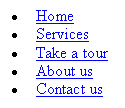
Looks great, doesn’t it? Note, though, that building your menu this way does bring up a new accessibility problem: this navigation won’t make sense to anyone who has disabled CSS. Without CSS, the navigation looks like this:
That’s quite a problem. The solution? Let’s put the tabs into a list! The HTML will look like this:
<ul id="navigation">
<li><a href="/"><span>Home</span></a></li>
<li><a href="/"><span>Services</span></a></li>
<li><a href="/"><span>Take a tour</span></a></li>
<li><a href="/"><span>About us</span></a></li>
<li><a href="/"><span>Contact us</span></a></li>
</ul>
Now, let's create some CSS rules for our list items, so that all the menu tabs display next to one other on the same line:
#navigation

{

list-style: none;

padding: 0;

margin: 0;

}


#navigation li

{

float: left;

display: block;

margin: 0;

padding: 0;

}
To get rid of the bullets, we used the CSS command, list-style: none. To display our menu tabs inline, stacked next to each other, we used float: left.
At this point, some of the more expert CSS coders may question the point of keeping the <span> tag, especially those who’ve read Doug Bowman’s Sliding Doors article. The reason we leave in the <span> tag is to make the entire menu tab clickable. If we were to assign one of the corners to <li> as a background image, that corner wouldn’t be clickable.
IE 5.x Problems
Unfortunately, these tabs won’t work on IE 5.0 on PC (and a couple of other browsers), as the rounded edges of the tabs don’t appear. As such, each menu tab will be displayed as a rectangle, with sharp corners. There’s an easy solution to this, which is to insert display: block into the #navigation a and #navigation a span CSS commands.
Sounds easy, right? Unfortunately, it’s not. By inserting these commands into the CSS, IE 5 on Mac will stack the menu items on top of each other. To make these display properly for IE 5 on Mac, we’ll need to also insert the float:left command, but apply it only to this browser. But how do we apply a CSS command to just one browser? Easy — we use the commented backslash hack:
#navigation a, #navigation a span

{

display: block;

float: left

}


/* Commented backslash hack hides rule from IE5-Mac */

#navigation a, #navigation a span

{

float: none

}

/* End IE5-Mac hack */
The first CSS command says to float the menu tab content to the left, and the second CSS command cancels this out for every browser except IE 5 on Mac. When two CSS commands are specified for the same selector, the second one always takes precedence. However, IE 5 on Mac can’t read the second command because of the slashes and stars, so defaults to the first CSS command. (If you really want to know how and why this works, read Commented Backslash MacIE5 CSS Hack by Sam Foster.)
The Final Code
The final HTML is:
<ul id="navigation">

<li><a href="/"><span>Home</span></a></li>

<li><a href="/"><span>Services</span></a></li>

<li><a href="/"><span>Take a tour</span></a></li>

<li><a href="/"><span>About us</span></a></li>

<li><a href="/"><span>Contact us</span></a></li>

</ul>
And here’s the entire CSS code:
#navigation a

{

color: #000;

background: #fb0 url("left-tab.gif") left top no-repeat;

text-decoration: none;

padding-left: 10px

}


#navigation a span

{

background: url("right-tab.gif") right top no-repeat;

padding-right: 10px

}


#navigation a, #navigation a span

{

display: block;

float: left

}


/* Commented backslash hack hides rule from IE5-Mac */

#navigation a, #navigation a span

{

float: none

}

/* End IE5-Mac hack */


#navigation a:hover

{

color: #fff;

background: #26a url("left-tab-hover.gif") left top no-repeat;

text-decoration: none;

padding-left: 10px

}


#navigation a:hover span

{

background: url("right-tab-hover.gif") right top no-repeat;

padding-right: 10px

}


#navigation

{

list-style: none;

padding: 0;

margin: 0

}


#navigation li

{

float: left;

display: block;

margin: 0;

padding: 0

}
The End Product… With and Without CSS
Let’s look at it one more time. First, the CSS version of the nav:
When CSS is disabled, it looks like this:
Now, that really is accessible!
Limitations
As you may already know, support for CSS can be shaky in older browsers. As such, these tabs simply won’t work in Netscape 4 and IE 4 (still used by less than 1% of Web users). The way around this problem is to use an external CSS document that you call up using the @import directive. These browsers will then ignore the CSS document.
Frequently Asked Questions (FAQs) about Accessible Menu Tabs
How can I create accessible menu tabs with rounded borders?
Creating accessible menu tabs with rounded borders involves using CSS. You can use the border-radius property to create rounded corners. For example, you can use the following code:.tab {
border-radius: 10px;}
This will give your tabs a rounded appearance. Remember, the higher the value you set for the border-radius, the more rounded the corners will be.
How can I make my menu tabs responsive?
To make your menu tabs responsive, you can use CSS media queries. Media queries allow you to apply different styles depending on the size of the user’s screen. For example, you can use the following code:@media (max-width: 600px) {
.tab {
width: 100%;
}}
This will make your tabs take up the full width of the screen on devices with a screen width of 600px or less.
How can I add icons to my menu tabs?
You can add icons to your menu tabs by using icon fonts such as Font Awesome or by using images. If you’re using Font Awesome, you can add an icon to a tab with the following code:<div class="tab">
<i class="fa fa-home"></i>
Home</div>
This will add a home icon to your tab.
How can I add a hover effect to my menu tabs?
You can add a hover effect to your menu tabs by using the :hover pseudo-class in CSS. For example, you can change the background color of a tab when the user hovers over it with the following code:.tab:hover {
background-color: #ddd;}
This will change the background color of the tab to light gray when the user hovers over it.
How can I make my menu tabs accessible for keyboard users?
You can make your menu tabs accessible for keyboard users by using the tabindex attribute in HTML. The tabindex attribute specifies the order in which elements will receive focus when the user navigates through them with the keyboard. For example, you can use the following code:<div class="tab" tabindex="0">
Home</div>
This will make the tab focusable by keyboard and it will be the first element to receive focus.
How can I add a dropdown menu to my tabs?
You can add a dropdown menu to your tabs by using HTML and CSS. You can create a dropdown menu with the following code:<div class="tab">
Services
<div class="dropdown-menu">
<a href="#">Web Design</a>
<a href="#">SEO</a>
<a href="#">Marketing</a>
</div></div>
This will create a dropdown menu with three options under the Services tab.
How can I make my menu tabs accessible for screen reader users?
You can make your menu tabs accessible for screen reader users by using ARIA roles and properties in HTML. For example, you can use the following code:<div class="tab" role="tab" aria-selected="true">
Home</div>
This will indicate to screen reader users that the element is a tab and that it is currently selected.
How can I animate the transition between tabs?
You can animate the transition between tabs by using CSS transitions. For example, you can use the following code:.tab {
transition: background-color 0.3s ease;}
This will animate the change in background color over a period of 0.3 seconds when the user switches between tabs.
How can I add a border to my tabs?
You can add a border to your tabs by using the border property in CSS. For example, you can use the following code:.tab {
border: 1px solid #ccc;}
This will add a 1px solid border around your tabs.
How can I change the font size of my tabs?
You can change the font size of your tabs by using the font-size property in CSS. For example, you can use the following code:.tab {
font-size: 18px;}
This will set the font size of your tabs to 18px.
Trenton is crazy about Web usability and accessibility – so crazy that he went and started his own web accessibility and usability consultancy to help make the Internet a better place for everyone.

Published in
·Android·App Development·iOS·Mobile·Mobile Web Development·Tools & Libraries·January 28, 2015