Changes in RC2
The official release of Firefox 2.0 is right around the corner and the second release candidate (RC2) was made available last week. Release candidates provide insight into the features and functionality that will be available in the final release. Much has changed since the Firefox 2.0 alpha builds were made available to the public early this year. A number of prominent features, including the innovative Places interface and revamped bookmark system have been removed and slated for resurrection in future versions. The postponement of highly anticipated features generated a lot of controversy and led many to challenge the validity of the 2.0 designation. Now that we are on the verge of the official 2.0 release, we can evaluate the changes and determine if the upcoming version lives up to the high standards set by its predecessors.
Numerous elements of the user interface have received a considerable stylistic overhaul. Although these changes are primarily aesthetic in nature, several alterations also affect usability. First present in the second beta release, the initial modifications suffered from several minor deficiencies that made the whole thing look rather awkward, particularly on Linux. Most of the problems introduced by the visual changes were resolved in the first release candidate. In RC1 and RC2, the various elements of the URL bar finally have a consistent size and shape. Unfortunately, the green arrow button is difficult to remove from URL bar, but it can be accomplished by hitting about:config and tweaking the browser.urlbar.hideGoButton, changing it to "true." The magnifying glass button in the search bar appears impossible to remove.
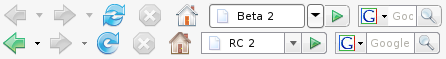
Toolbar progression from Beta 2 to RC2
These buttons are completely unnecessary for many users, and they needlessly waste toolbar space. The icons have also been updated, and now feature more subdued colors. I like the look of the new reload icon, but I prefer the lighter home icon from Beta 2 rather than the drab RC2 home icon. GNOME users migh want to check out SooperDoode's Tango skin for Firefox 2.0, which is fully compatible with RC2.
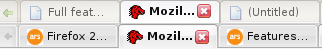
Tabs in Beta 2 and RC2
The appearance of tabs has also been altered. In the second beta, the inactive tabs had a faded appearance, which made them difficult to read. In RC1, the fading was removed, and a gradient was added to the active tab. The inactive tabs, which have a flat appearance, look as though they are in a row behind the active tab. Although the new tab theme looks very attractive, it isn't consistent with the computer's default system theme. Visual integration is one of the factors that contributed to Firefox's initial success over the original Mozilla browser suite. Sacrificing visual consistency with the rest of the desktop for an elegant stylistic flourish could be counterproductive, particularly in light of the fact that many users who don't care about visual consistency generally use specialized themes anyway. Despite my preference for the unadulterated GTK look, I think that the new tab style is well done, and I'm glad that they got rid of the faded effect used for inactive tabs in Beta 2.

Tab management in IE7 and Firefox 2
Firefox 2.0 features improved tab management functionality inspired by concepts from Internet Explorer 7. In the 1.5.x series, Firefox perpetually decreases tab size in order to accommodate all presently open tabs. In Firefox 2.0, only a specific number of tabs will be displayed on the screen at any given time, and users can scroll through available tabs by using arrow buttons that appear on both ends of the tab bar (or by using the mouse scroll wheel). Additionally, a menu button provides a complete list of all available tabs, and enables the user to switch to a particular tab without any scrolling. Note the similarities between IE 7 and Firefox 2.0.
The latest iteration of Microsoft's dominant web browser, which includes numerous features initially found in other browsers, has clearly generated some new features of its own, which in turn have been adopted by the open source upstart. Although some may think poorly of feature-imitation, these signs of mutual influence are a positive reflection of the advantages of renewed competition in the browser market. Although the tab scrolling feels a bit unnatural to me, it does increase usability. The tab menu is a great idea, and it is relatively well implemented in Firefox 2.0. My only complaint is that one can't rearrange tabs by drag-and-drop reordering tab list items. Dragging around the actual tabs can get cumbersome when a lot of scrolling is involved.
reader comments