
Making a Murderer: 7 Hilarious Things Wrong with Ken Kratz’s Website
Ken Kratz is not a Web or UX Designer.
I get that.
But he is a lawyer. He should have at least:
- A little bit of money
- Some common sense
- Decent logical reasoning skills
His website puts up a strong argument against all three of the previous counts.

Initial Thoughts
If Ken Kratz had a child build his website without his awareness and did not make changes at the fear of hurting their feelings, then that would be a permissible excuse.
Otherwise, Ken Kratz’s website looks like he went on Fiverr, filtered for the worst rated Web Designer he could find, and then haggled until he got 50% off.
#1 Worst Personal Photo. Ever.

Being a lawyer could be the absolute least acceptable profession to go for a “casual appearance”.
Yet here we have it.
Ken Kratz’s main personal photo is a selfie of himself wearing a t-shirt.
He also did not have the technical wizardry to make his image slightly less wide in order to cut out the randomly floating towel(?) on the right.
#2 What is that logo?
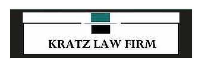
Ok… so we have a rectangle, and inside that we have a slightly smaller rectangle, and then at the top of that we have a break in the middle, where we insert two more rectangles with a thin line in between.
Ken Kratz either gave that description to someone or someone made that for him and he responded with, “Yeah, I like that. Let’s go with that one.”
#3 Water Color Painting Background

Designer: “Hey Ken, what kind of background do you want for your webpage?”
Ken: “Oh I don’t know. I want it to be personal. I want it to represent me… Why don’t we go with something like an aqua greenish water color painting?”
Designer: “Ugh… sure”
#4 Strangely Random Font Selection

There is a green box with a red border on the landing page with Ken’s contact info.
Within this box, Ken manages to use a combination of 7 different font sizes, thickness, and colors.
Absolutely fascinating.
This does not happen by accident.
This was a decision somebody actually made.
#5 Alignment? Screw Alignment!

#6 Link or Not a Link? Let’s make them Guess!

#7 Random and Repetitive Buttons

Ken: “Let’s have 5 different buttons from 5 different publications, all discussing the things they forgot to tell the Netflix viewers.”
Designer: “Ok”
Ken: “And when I say different, I mean they should all be in different fonts, have random colored background, and some of them should have sharp corners while others have slightly rounded corners.”
Designer: “Ok”
You may try and give Ken Kratz the benefit of the doubt that this website was built 30 years ago.
The recently aired Netflix “Making a Murdererer” show references provide evidence of the contrary.
This website was updated recently.
