In the first article we’ve seen some useful tips and tricks for better organization of forms, galleries and search functions; in the second one we’ve seen, through some examples of more or less known applications available in the marketplace, which are the most common mobile patterns used to give suggestions, make invitations and provide feedback. In this article, the last one in this series, you’ll discover the most common anti-patterns and understand why and when to avoid them. Let’s discover more about the world of the so-called “anti-patterns”.
What are Anti-Patterns?
As for the definition of “pattern”, let’s see what Wikipedia says an “anti-pattern” is:An anti-pattern (or antipattern) is a pattern used in social or business operations or software engineering that may be commonly used but is ineffective and/or counterproductive in practice. The term was coined in 1995 by Andrew Koenig, inspired by Gang of Four’s book Design Patterns, which developed the concept of design patterns in the software field. The term was widely popularized three years later by the book AntiPatterns, which extended the use of the term beyond the field of software design and into general social interaction. According to the authors of the latter, there must be at least two key elements present to formally distinguish an actual anti-pattern from a simple bad habit, bad practice, or bad idea:The first thing that many web designers intend to do when they start developing a project for a new customer is to work on interfaces that they want to be new, edgy, creative, and innovative. It is not unlikely, however, that the effect they wish for is not the one actually produced. On the contrary, most of the time they’re just bad, hard to understand, and harder to use. What a good web designer should always keep in mind is that during mobile app development they should try to work off an old web development background. Creating interfaces for mobile applications is not merely the act of translating old user interaction models to a new platform. People often assert their “creativity” and “innovation” by introducing non-standard UI elements, which is no good at all. Recently, developers have been paying increasing attention to the good principles to be followed in the creation of graphical user interfaces for mobile applications. For this reason, many of them are making appropriate changes on existing apps and it is not always easy to find more or less known models of anti-pattern. In this regard, I have considered it more appropriate to provide you a mini-series of “rules” (or if you prefer, tips), a sort of guide to follow in order to avoid realizing an unwanted anti-pattern:Many anti-pattern ideas amount to little more than mistakes, rants, unsolvable problems, or bad practices to be avoided if possible. Sometimes called pitfalls or dark patterns, this informal use of the term has come to refer to classes of commonly reinvented bad solutions to problems.
- Some repeated pattern of action, process or structure that initially appears to be beneficial, but ultimately produces more bad consequences than beneficial results;
- An alternative solution exists that is clearly documented, proven in actual practice and repeatable.
- Offer one-click access to the main page: let your users easily come back to the home page of your mobile application in a quick and intuitive way.
- If you want to insert a “Contact us” link, remember that it would be better positioned in the top right than in a hidden footer: clear, visible and easy to click.
- Remember to style tabs so that each one of them has its own icon, for example, and that the selected one has some features that distinguish it by others, such as a color or effect, so that the user knows in which space they are operating.
- If you are looking for a way to innovate with your mobile app, think about and focus on your core features, on what you intend to offer to your users, on what could be their problems and needs and rely on best practices for the interface design. If you design a custom control, don’t forget to test it and improve it to make sure it is simple to use.
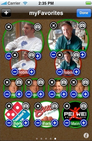
- Users expect familiar icons to offer specific features, so choosing a familiar icon and using it in an unfamiliar way will cause confusion. Do you think this system to add people to the “Favourites” category is correctly thought out?
- Avoid the so-called “Idiot box” and use more effective and less disruptive techniques to provide feedback or go on with navigation.
- If you want to display a set of data on a chart, remember to visually represent only elements in charts and graphs that are necessary to communicate the information represented on the graph. Useless data only creates confusion and slows the whole process. Look at this example:

- Don’t let your users loose in an ocean of … buttons!
 Use standard patterns for displaying page level actions and provide contextual tools for item level actions rather than repeating the same button.
Conclusions
We’ve come to the conclusion of this mini-series dedicated to mobile design patterns. I hope the topic was of interest to you and that these three articles will be helpful for your future works. I’ll be back soon to talk about the design of interfaces for mobile applications. Thanks for your attention.Frequently Asked Questions (FAQs) about Mobile Design Anti-Patterns
What are some common examples of mobile design anti-patterns?
Mobile design anti-patterns are practices that may seem beneficial initially but can lead to problems in the long run. Some common examples include using tiny touch targets, hiding critical features behind hamburger menus, and overloading users with too much information. These practices can make it difficult for users to navigate and interact with the app, leading to a poor user experience.
How can I avoid mobile design anti-patterns?
Avoiding mobile design anti-patterns involves understanding the needs and behaviors of your users. Conduct user research and usability testing to identify potential issues. Also, follow best practices for mobile design, such as using large touch targets, prioritizing essential features, and providing clear and concise information.
What is the impact of mobile design anti-patterns on user experience?
Mobile design anti-patterns can significantly impact user experience. They can make it difficult for users to navigate and interact with the app, leading to frustration and dissatisfaction. This can result in lower user engagement and retention rates, negatively affecting the success of your app.
Are there any tools or resources to help identify mobile design anti-patterns?
Yes, there are several tools and resources available to help identify mobile design anti-patterns. These include usability testing tools, user research platforms, and design guidelines from platforms like Apple and Google. Additionally, there are many online resources and communities where you can learn from other designers’ experiences and get feedback on your designs.
Can mobile design anti-patterns ever be beneficial?
While mobile design anti-patterns are generally considered harmful, there may be situations where they can be beneficial. For example, hiding less important features behind a hamburger menu can help simplify the interface for a complex app. However, it’s crucial to carefully consider the potential impact on user experience and to regularly test and iterate your designs.
How can I educate my team about mobile design anti-patterns?
Educating your team about mobile design anti-patterns can involve conducting workshops or training sessions, sharing resources and articles on the topic, and incorporating discussions about anti-patterns into your design process. It’s also helpful to regularly review and critique your designs as a team to identify potential anti-patterns.
What are some strategies for fixing mobile design anti-patterns?
Fixing mobile design anti-patterns involves identifying the issues, understanding their impact on user experience, and coming up with solutions. This can involve redesigning certain elements, reorganizing your interface, or even rethinking your overall design approach. It’s also important to test your solutions with users to ensure they effectively address the issues.
How can I stay updated on the latest mobile design anti-patterns?
Staying updated on the latest mobile design anti-patterns can involve regularly reading design blogs and articles, participating in design communities, and attending design conferences or webinars. It’s also helpful to regularly conduct user research and usability testing, as this can help you identify emerging anti-patterns in your own designs.
How do mobile design anti-patterns differ across platforms?
Mobile design anti-patterns can differ across platforms due to differences in design guidelines, user behaviors, and device capabilities. For example, what works well on iOS may not work as well on Android, and vice versa. It’s important to understand the specific considerations for each platform and to test your designs on multiple devices.
Can mobile design anti-patterns affect app performance?
Yes, mobile design anti-patterns can affect app performance. For example, overloading the interface with too much information or graphics can slow down the app. Also, complex navigation structures can make the app more difficult to use, leading to lower user engagement and retention rates. It’s important to consider both the user experience and performance aspects when designing your app.
 Annarita Tranfici
I have a Bachelor's degree in European languages, cultures, and literature from the University of Naples. I'm passionate about graphics and web design, and for several years I've been working on projects and designs for many companies. I'm a writer for the Audero User Group; my specialties are HTML, CSS, Web Design, and Adobe Photoshop.