Better Password Masking For Sign-Up Forms

Email Newsletter
Weekly tips on front-end & UX.
Trusted by 200,000+ folks.
 Flexible CMS. Headless & API 1st


Masking passwords is an old practice that’s commonly implemented in sign-up and log-in forms. It’s used to prevent over-the-shoulder snoopers from catching the user’s password. While masking passwords is a good security practice, there’s a chance it could jeopardize the user experience of your sign-up form. When users sign up on a website, they expect a no-hassle, worry-free form to fill out. But masking the password could prevent that.
Good For Logging In, Bad For Signing Up
Log-in forms are used more often than sign-up forms. Users only need to sign up once to create an account, whereas they will need to log in multiple times to access their account. Because log-in forms are used so frequently, there’s a strong chance that users will end up typing their password in front of other people. Users sometimes want to show their friends or colleagues something on the website, and they would need to log in to do so. Therefore, masking passwords in log-in forms is good because it keeps passwords hidden every time the user logs in.
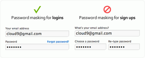
However, masking passwords in sign-up forms is different. Password masking generally causes users to make more typing errors because they can’t see what they’re typing and can’t tell whether they’ve made a mistake. The consequences of making a typing error when logging in are not as serious as making one when signing up. If the user fails to type in the right password when logging in, they simply try again. If they type in the wrong password when signing up, they’ll get locked out of their account when they try to log in and will have to reset their password. The user isn’t to blame when this happens. It’s the designer’s fault for not making it easy for the user to see what they’re typing in the password field.
Recommended reading: Why Passphrases Are More User-Friendly Than Passwords
What If We Omit Confirmation Fields In Sign-Up Forms?
A big hurdle that password masking creates for users is the password-confirmation field commonly found in sign-up forms. This field requires users to retype their password and checks that both match so that the wrong password doesn’t go through. The reason why password-confirmation fields exist is that users sometimes make typos when typing their password with masking on, and this extra field can catch those typos.
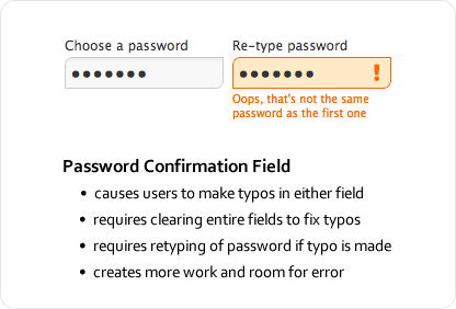
Password-confirmation fields might be well intentioned, but they have a downside. Users are prone to making even more typos because they have to type their password twice in separate fields with masking on. What’s worse is the extra work they have to do to correct their typos; because they can’t see where their typos are, users have to clear the fields entirely and retype their password. The password-confirmation field not only causes more typos, but forces users to do more work to fix them, thus slowing users down and making sign-ups more of a pain.
Recommended reading: The Current State Of Authentication: We Have A Password Problem
Unmasking Passwords Temporarily Decreases Typos
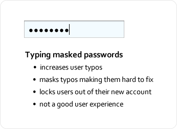
Masking passwords in sign-up forms might give users more trouble than it’s worth. It masks not only the password, but any typos the user makes, making them hard to spot and fix. The security it provides is often less than helpful because many people usually sign up for websites in private, with no one looking over their shoulder. Signing up is usually a one-time deal; once they’ve done it, they don’t need to do it again. Displaying their password in plain text that one time when they are alone is probably not as a significant security risk as we tend to think. The chance of a snooper catching the password is slim to none, even if the user is signing up in public.
The solution to all of these issues is to temporarily unmask the password so that the user can fill in the field quickly and accurately — i.e. unmasking the password for a moment so that the user can see what they’ve typed. Temporary unmasking decreases typos and makes it easy for users to catch and fix any typos they make. And the user doesn’t have to worry about snoopers stealing their password because the unmasking is quick, e.g. if we unmask a couple of last characters typed in. Snoopers would have to memorize a string of (hopefully) random alphanumeric characters in a matter of seconds, which is very hard to do. If we unmask only last characters, they would need to look over the shoulders for a longer period of time to be able to “catch” the whole pass phrase.
I strongly believe that a lot of the snooping paranoia is in our minds — the bigger issue is users getting locked out of their account because of typos caused by masked passwords. Below are a couple of simple techniques to prevent that from happening.
Recommended reading: Creating Secure Password Resets With JSON Web Tokens
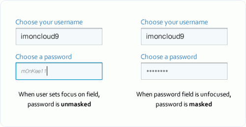
Unmasking On Field Focus
You can make the password field easy to fill in and secure at the same time by unmasking the password when the keyboard focus is on the field and then automatically masking it when the focus is off the field. This allows the user to see the characters they’re typing only when the password field is selected, thus decreasing the risk of typos and preventing others from sneaking a peek when the user has moved on to other fields.
Another small security measure you could add is to display the user’s password in small, light-gray italicized text. Thus, being able to make out each character would require moving close to the screen. In the unlikely event that a snooper is looking on, the modified text would make the password indiscernible to everyone except the person sitting right in front of the screen.
Another option would be to display only the last characters of the password while hiding other characters with asterisks, thus confirming the user’s input as the password is typed in.
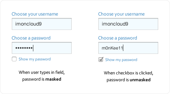
Unmasking With A Checkbox
Another approach is to provide a checkbox for unmasking. Thus, when the user types their password, it is masked, but when they check the box, it gets unmasked, allowing them to see whether they’ve made a typo. A little more effort is required with this approach with the checking and unchecking, but it’s far better than a password-confirmation field because it enables users to see and fix their typos with ease.
Balancing Security And User Experience
Following design conventions is generally advisable, but when a convention slows users down, complicates a task or increases the chance of error, it needs serious reconsideration. Security should be balanced with the user experience. Favor security too much over the experience and you’ll make the website a pain to use. Favor the experience too much over security and you’ll make visitors nervous about using the website. When you find that balance, users won’t have any trouble using your website, even if it doesn’t adhere to every design convention.
Further Reading
- The Growing Need For Effective Password Management
- How To Prioritize User Security When Collecting Offline Data
- Building Your Security Strategy (Case Study)
- Implementing A Reset Password Feature With Next.js Dynamic Routes


