Finally, a fluid Hicksdesign
I’ve been wanting a fluid layout on this site for about 5 years. I had a brief redesign back in 2005 where I flirted with it for a few months, but it was soon switched back to fixed as I couldn’t get it right.
Last year, I discovered CSS media queries while working on the internal pages of the Opera Browser, and tried to implement it here. It was half-assed and was removed, again after a few months.
It took Ethan Marcotte’s excellent article for A List Apart Responsive Web Design to motivate me to do it properly, as well as know HOW to do it properly. I don’t think I’ve read anything as exciting and inspirational for a long time. So I started from scratch, working on the basic skeleton of the layout, getting the various resolution dependant layouts in place, before re-implementing the design (making a few changes long the way of course).
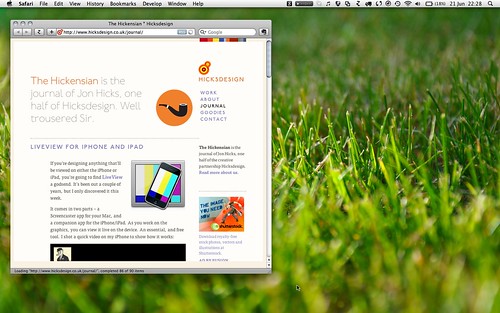
So now, you’ll see the layout and type size change depending on the available width. From a narrow single column (which should be the view you’ll see on mobile devices)…

To a 2 column…
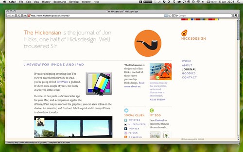
to the more familiar 3 column style I’ve had here for a while…

and finally to an x-large 4 column layout…
For now, only the journal has been re-jigged, but all the other sections will follow as soon as time allows. It won’t be perfect, and I expect there to be plenty of fine-tweaking for a while yet. Waiting until it’s perfect before launching just means it won’t happen!
The next project for the site is implementing SVG icons …