Form validation has been a finicky business since the web was born. First came the server-side validation error summary. Then we evolved to client-side validation to verify results inline. Now, we have the marching giant that is HTML5 and CSS3: HTML5’s forms chapter offers new input types and attributes that make validation constraints possible. CSS3’s basic UI module provides several pseudo-classes to help us style those validation states and change a field’s appearance based on the user’s actions. Let’s take a look at combining the two to create a CSS-based form validator that has fairly broad browser support.
The more we can guide a user on how to complete a form field in real-time, the less likely they are to make mistakes. Look at the CSS3 form validation example in a browser that supports the CSS3 UI pseudo-classes, such as Chrome 4+, Safari 5+ or Opera 9.6+. I use CSS3 UI pseudo-classes and HTML5 form attributes to do CSS-based validation. Let’s see how that works.
CSS3 UI pseudo-classes#section2
The UI module has several pseudo-classes that help to style form fields in various states.
validinvalidrequiredoptionalin-rangeout-of-rangeread-onlyread-write
In the demo above, I use the required, invalid, and valid pseudo-classes to accomplish the CSS validation:
input:focus:required:invalid {
  background: pink url(ico_validation.png) 379px 3px no-repeat;
}
input:required:valid {
  background-color: #fff;
  background-position: 379px -61px;
}
Since we only want to denote that a field is invalid once it has focus, we use the focus pseudo-class to trigger the invalid styling. (Naturally, flagging all required fields as invalid from the start would be a poor design choice.)
Bringing focus to an invalid required field triggers the style to show the exclamation graphic, which alerts the user that something needs to be entered. Once the field’s validation constraints are satisfied, the valid pseudo-class triggers. Now, we remove the focus pseudo-class so that the green tick that indicates a correct field will remain.
All the pseudo-classes listed above are self explanatory. The in-range and out-of-range pseudo-classes should be used in conjunction with the min and max attributes, whether on a range input, a number field, or any other types that accept those attributes. For example, if a user enters a value that is out-of-range, we can use the pseudo-class to change the styling to reflect that state; likewise, we can do the same for in-range values.
Only Opera supports the range pseudo-classes at the moment. Other browsers will follow soon.
Additional types and attributes to help us#section3
HTML5 forms also introduce new input types such as email, url, and number. For example, email only triggers the valid pseudo-class when the user enters a valid e-mail address; the same is true for number and url. Url constraint validation differs among browsers. In Opera, typing “http://” flags the url field as valid. In Chrome typing “http://w” flags it valid, while simply typing “http:” in Safari flags a url as valid.
There are also a few attributes which help validation such as placeholder, required, maxlength, pattern, min, max, and step:
<input id="postcode" name="postcode" type="number" min="1001" max="8000"
maxlength="4" required />
The postcode field uses the new number type and a few of the new attributes. In Australia, a postcode can only be four digits so we set the maxlength attribute to restrict it. We also want to restrict how high or low the postcode can be so we use min and max attributes to set boundaries. The required attribute is self explanatory.
We can use the step attribute to further restrict a field with min and max. By default, step is set to one, so any number between the min and max values incremented by at least one validates. Changing step to 100 validates between the set range if the value the user entered is an increment of 100. For example, if I set the step attribute to 100 on my postcode field, 1001 will be a valid entry, as will 1101, 1201, 1301, etc.
Find the pattern#section4
To trigger the invalid pseudo-class on more specific conditions, such as a rudimentary phone number, we can use the pattern attribute which allows us to apply a regular expression to the field.
<input type="tel" id="tel" name="tel" pattern="d{10}" placeholder=
"Please enter a ten digit phone number" required />
The regular expression above is a simple one. It says, “I will only accept exactly ten digits and nothing else.” That way, the field will always be invalid until the regular expression requirements are met. Notice how I have used the placeholder attribute to give the user a small hint.
We can really push the power of the pattern attribute by applying a more complex regular expression as I do on the password field:
<input id="password" name="password" type="password" title="Minimum 8
characters, one number, one uppercase and one lowercase letter" required
pattern="(?=^.{8,}$)((?=.*d)|(?=.*W+))(?![.n])(?=.*[A-Z])
(?=.*[a-z]).*" />
Since we have specific conditions that restrict what the user can enter, forcing them to create a more secure password, we set up a complex regular expression as shown above. The password must be at least eight characters long, contain one number, one lowercase letter, and one uppercase letter.
To help a user meet these conditions, we use the title attribute to help them understand exactly what the requirements are. We don’t use the placeholder attribute here, as it needs more explanation and placeholder should only be used for short hints.
Adding helpful hints#section5
If the user never hovers over the field, and instead tabs through them, they may never notice the extra instructions in the title attribute. You may notice that on the phone, postcode, and password fields, a helpful hint appears when a field needs extra instructions.
<input id="password" type="password"  /><p class="validation01">
  <span class="invalid">Minimum 8 characters, one number, one uppercase
letter and one lowercase letter</span>
  <span class="valid">Your password meets our requirements, thank you.
</span>
</p>
The markup above has an extra container with both the invalid and valid hint boxes. This way, when the field is invalid, it will contain the extra information to help the user. When they get it right, our message and the green tick reassures them that they have filled it out correctly.
.validation01 {
  background: red;
  color: #fff;
  display: none;
  font-size: 12px;
  padding: 3px;
  position: absolute;
  right: -110px;
  text-align: center;
  top: 0;
  width: 100px;
}
input:focus + .validation01 {
  display: block;
}
input:focus:required:valid + .validation01 {
  background: green;
}
input:focus:required:valid + .validation01 .invalid {
  display: none;
}
input:focus:required:invalid + .validation01 .valid {
  display: none;
}
To show or hide the helpful hint, depending on what state the field is in, we can target the field by chaining the pseudo-classes, using the adjacent sibling combinator to target the correct hint. Once the field has been filled out correctly, the background changes to green and the valid message displays.
UX concerns with the current approach#section6
There is one main gripe with how the invalid pseudo-class currently works when a field is required and has additional conditions that must be satisfied—for example, when a field is required and its type is email. Because the field is always invalid until its conditions are met, it will pick up the invalid styles. In this case, the field would be instantly invalid, and marked red with errors even before the user has entered anything. That᾿s why we use the focus pseudo-class to show the invalid styles only when a field is in focus. This isn’t optimal: if a user moves away from the field without meeting its validation requirements, the field will not indicate that something is wrong until the user brings focus back to it.
A proposed solution to this would be to add the indeterminate pseudo-class available on radio and checkbox inputs. Technically, a field that has more conditions than being required when it’s empty is neither valid nor invalid but rather indeterminate. This idea would fix the instant invalid issue and allows us to optimally style the field depending on its validation state.
Additionally, we can accomplish some pretty comprehensive functionality without JavaScript. We can tell what state a field is in, if it’s required, tell it to conform to a certain pattern with regular expressions, specify minimum and maximum values, and much more. But what if that’s not enough? What if we want to take it further? Well we’re in luck as the HTML5 forms chapter also specifies the constraint validation API.
Constraint validation API#section7
Alongside all the new attributes, input types, and CSS3 pseudo-classes, the HTML5 forms chapter also specifies a simple JavaScript API that allows us to extend form validation capabilities further with some handy built-in methods, attributes, and events. Take a look at the updated demo, which hooks into the constraints validation API.
Each form field has a new attribute called validity. The validity attribute returns a ValidityState object which represents an element’s current validity state(s). The ValidityState object contains several Boolean attributes which identify which validity state the current element is in. Basically, they’re a series of true/false answers that tell a developer exactly what is wrong with the field:
-
valueMissing
This attribute returnstrueif a required element is empty. -
typeMismatch
This value applies to all the new type attributes. For example, if anemailvalue is incorrect, this attribute returnstrue. -
patternMismatch
When an element contains thepatternattribute and doesn’t conform to the regular expression conditions, this attribute will returntrue. -
tooLong
When any element surpasses itsmaxlengthproperty this attribute will returntrue. -
rangeUnderflow and rangeOverflow
If an element’sminormaxattributes are above or below the specified values, this attribute will returntrue. -
stepMismatch
When an element with thestepattribute doesn’t conform to the requiredstepvalue, this attribute returnstrue. -
valid
If any of the values listed above returntrue, this attribute returnsfalseto indicate the field is invalid. Otherwise, if all the conditions are met, it will returntrue.
And there’s more#section8
The invalid event is another handy feature. It will be invoked by the field when it is still invalid. So we can attach behaviour to it and, in our case, change the field(s) styling to reflect their current state.
Additionally, the checkValidity() method can be executed on either an individual field or the form as a whole, and returns true or false. Executing the method will also programmatically fire the invalid event for all invalid fields, or, if executed on a single field, only for that element.
Take me to the demo#section9
Let’s take our previous demo and enhance it with the constraint validation API. Taking what we’ve learned from Luke Wroblewski’s Inline Validation in Web Forms and our own findings, we can apply these ideas to our form to create the optimal inline validation experience.
The first thing we can fix is the instant error styling of an invalid field. Rather than instantly styling the field to indicate the user hasn’t met the requirements, we wait until they move away from the field to show any issues.
If they meet the requirements while the field is still in focus, we let our user know instantly that the field is correct. We do this by attaching the input event to check to see if the field is valid. When it is, we update the styles to reflect it straight away.
If a field has incorrect values, and the user moves to the next field, the blur event will check the field’s validity and then apply the error styles to let the user know something is wrong. It will retain the error styling until the requirements are met.
What about older browsers?#section10
All the topics discussed are fairly new and browser support, while good, wouldn’t cut it in a real-world production environment where we must support older browsers. That’s where the script I wrote comes in handy.
For browsers that don’t support the HTML5 forms chapter and the constraint validation API, the script emulates that functionality. For browsers that support these features, the script detects support and hooks into the native functionality. Let’s take a look at the further updated demo with the new script added in. Try it in IE or Firefox to see it work like the native supporting browsers do.
Browser support#section11
This script has been tested and works in the following browsers:
- IE6+
- Firefox 1+—FF4 will have native support soon.
- Chrome 4+—Native support.
- Safari 3.2+—Safari 5 has native support.
- Opera 9.6+—Native support.
The following features are emulated in the script:
- Each field has the
validityobject which is live and will let you know the field’s current state. - The
checkValidity()method is available and indicates whether the form or a specific element is invalid. - The
pattern,placeholder,required,min,max, andstepinput attributes are supported. - The
placeholderandrequiredattributes are supported for textareas. - The
requiredattribute is supported for select inputs. - The
emailandurlinput types will check against a built-in regular expression and will be invalid until they conform.
Validation aplenty!#section12
Browser support for HTML5 forms and the CSS3 UI module is starting to improve. Opera 9 lead the way by implementing Web Forms 2.0 before it merged into the HTML5 forms chapter, but it has only supported the CSS3 UI module since version 9.6. Chrome has had support since version 4, Safari recently shipped it in version 5, Firefox is due to add support in a forthcoming beta of version 4, and IE9, if they continue their progress, should also have support in one of their preview builds.
We can do some amazing things with the new modules and chapters from CSS3 and HTML5 respectively. As browser support improves, these sorts of techniques become a viable option that can cater to the simple and the complex nature of form validation.
enhanced_2.html does not accept https urls in IE8
very nice val.
and also i hope all IE’s die(), exit(), quit() disappear
There are too many validation errors:
# when I enter only 1 digit in a password field, it says it’s valid;
# ‘daaa@sssb’ in email field is valid;
# ‘http://’ in website is valid;
Firefox 3.6.10, very last example. In Chrome it works better, but still not perfect.
Chrome 6:
email accepts a@b.c
website accepts http://w which while it strictly is a URL it isn’t a FQDN making it of little to no use.
And it allows http://. which isn’t a URL
I do like the spinner though.
Any particular reason for not using the HTML5 DOCTYPE? ATM it is invalid XML…
I think this is a requirement of ALA (using XHTML), but if they’re going to be putting out demos with HTML 5, they should allow you to use the correct doctype.
That aside, it’s nice to look forward and see how might use these features down the road.
Thanks
Nice article.
Chrome renders little up/down arrows at the right side of a number field that overlap the validation icon in the demo.
Not allowing spaces, brackets, dashes, slashes in phone numbers is a habit from the stoneage of form usability, as is requiring the protocol identifier, “http://”, which noone is used to enter into their browser’s location bar.
Deleting characters of valid inputs, making them invalid, does not always alter their state of recognition, i.e. they keep being labeled as valid.
“¦Â also ZIP or post codes often are not numbers, even if they look like such and may not contain letters or other characters. In Germany, for instance, they always consist of five digits, but may have leading zeros, i.e. <input type=”text” pattern=”d{5}”>. Even if the demo was correct for Australia, it’s not a good example.
What happens if a field is dependent on another field? For instance, let’s say for password confirmations? Or, what about if the field is only required if another field has a value of 1?
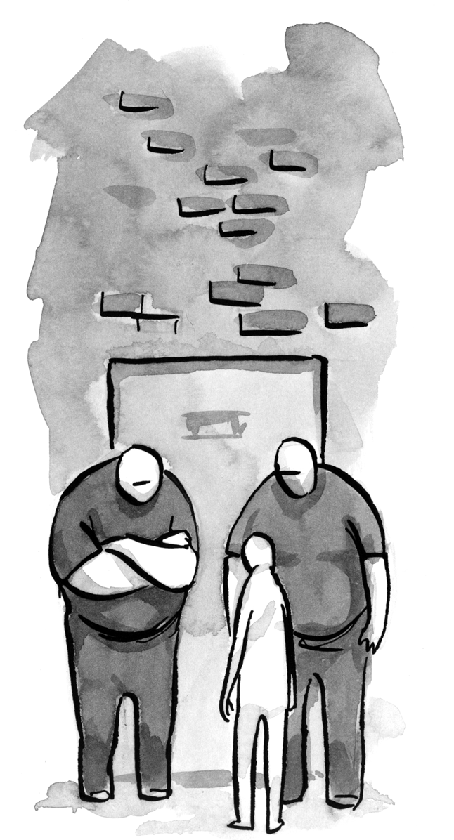
This article may give the impression that client-side validation obviates server-side validation. On the contrary: client-side validation does nothing for your security or data integrity, and should be provided solely as a service to your users. The bouncers in the cartoon should, if anything, be carrying the user on a litter.
The end result is twice as much CSS, highly inefficient CSS selectors (stacked pseudo selectors is horrible for efficiency) and still end up with the JavaScript you would have had to write without doing any of this new stuff.
Working on large scale projects where we are writing off IE6 entirely, we would always go with the solution that is the lightest. We can’t realistically look at pseudo/sibling selectors as an option until IE7 bites the dust (one :hover selector on a non-anchor can render IE7 completely useless with a large DOM).
These ideas are really cool but even with the degradation this won’t be a viable option for at least a decade. I sure hope I am wrong.
@scriptin
bq.
when I enter only 1 digit in a password field, it says it’s valid;
Passwords fields cannot be evaluated using javascript for security reasons. Entering anything will automatically validate in browsers that don’t support the constraint validation API natively.
bq.
“˜daaa@sssb’ in email field is valid;
The email regular expression is pretty loose. It’s more there to guide people rather than enforce super strict rules.
bq.
‘http://’ in website is valid;
That’s considered a valid entry in natively supporting browsers. Again it’s guiding and not enforcing.
bq. On the contrary: client-side validation does nothing for your security or data integrity, and should be provided solely as a service to your users.
I certainly wasn’t advocating client-side validation only, you should always have server side validation, as you’ve stated, for security and data integrity.
What I am saying though is client-side validation creates a much nicer user experience compared to server-side. Hence use of the word evolving.
I like the article a lot, thanks for the writeup!
The only thing I’d like to suggest as an improvement is, since we are dealing with HTML5/CSS3 anyway, to take the CSS-only route a little further by also replacing all HTML error messages with CSS generated content messages:
input.password:focus:required:valid:after {
display: block;
padding: 2px;
background: green;
color: #fff;
border: 1px solid #912C2C;
font-size: 12px;
white-space: pre;
content: “Your password meets our requirements, thank you.”;}
}
input.password:focus:required:invalid:after {
display: block;
padding: 2px;
background: red;
color: #fff;
border: 1px solid #912C2C;
font-size: 12px;
white-space: pre;
content: “Minimum 8 characters, one number, one uppercase letter and one lowercase letter.”;}
}
OR:
<input type=”password”
name=”password”
class=”password”
data-valid=”Your password meets our requirements, thank you.”
data-invalid=”Minimum 8 characters, one number, one uppercase letter and one lowercase letter.” />
+
input.password:focus:required:valid:after {
display: block;
padding: 2px;
background: green;
color: #fff;
border: 1px solid #912C2C;
font-size: 12px;
white-space: pre;
content: attr(data-valid); // HTML5 data-attribute
}
input.password:focus:required:invalid:after {
display: block;
padding: 2px;
background: red;
color: #fff;
border: 1px solid #912C2C;
font-size: 12px;
white-space: pre;
content: attr(data-invalid); // HTML5 data-attribute
}
That way you won’t have any more “bloat” in your document tree.
Unfortunately :after and :before cannot be applied to replaced elements aka inputs, textarea etc. While some browsers allow this it’s technically violating the spec, “see replaced content”:http://www.w3.org/TR/css3-content/#replacedContent
bq. The box model defines different rules for the layout of replaced elements than normal elements. Replaced elements do not have “˜::before”˜ and “˜::after”˜ pseudo-elements;…
I discussed this very subject on one of “my posts”:http://www.thecssninja.com/css/custom-inputs-using-css on my blog with a “test case”:http://www.thecssninja.com/demo/form_generated-content/
However, I was actually playing with using data-* attributes today using the exact idea you just demonstrated but by using an empty span with the attributes on it. Still some extra markup but less than there is now. e.g.
<input />
input:focus:required:valid + span:after { content: attr(data-valid); }
input:focus:required:invalid + span:after { content: attr(data-invalid); }
IE8+ will ignore any attr() calls to unregonised attributes, but all the other browsers manage fine.
Thanks, great read.
FF 4 Beta 6 now supports most features,
There are a few layout inconsistencies across browsers though these could be easily met with a few lines of CSS.
I notices that disabled and required attributes doesn’t play nice together.
Australian postcodes are 4 digits, but can also start with “0”. According to the form, the Darwin postcode “0800” is out-of-range.
Some very cool ideas in this article and some new concepts introduced. Looking forward to trying this out soon.
bq. Australian postcodes are 4 digits, but can also start with “0”. According to the form, the Darwin postcode “0800” is out-of-range.
Correct and they go above 8000 too. I was just using it as a loose example of what one could do to use the min, max and step attributes.
Nice!
Though as BryanRSmith said above, the spinner arrows on number inputs cover your icons.
I had this very problem yesterday on a project I’m working on, it’s annoying. In my case, the arrows sat on top of placeholder text I had on some small dd/mm/yyy fields.
If you set a width on an input, you have to allow for the arrows. But if you leave space for the arrows, then you’ve got weird extra space in browsers that don’t support them.
Even if you’re happy to allow extra space for the arrows, it’s still a bit of a guessing game… who knows how big they’ll be in other browsers or what they’ll look like?
Yeah the spinners can be a bit of an issue and the extra padding on the end, in addition with the sporadic differences between browsers makes styling number inputs a real pain.
The background issue could be fixed by targeting the number inputs and aligning the background image to the left. That however does break the consistent styling from other fields. Selects would have the background image appear behind the arrow also.
A solution could be:
input[type=number], select { background-position: 3px -61px; }
What a great piece of information. Congrats on the library too.
Seems to work great in Chrome. But in FF3+ and Safari the validation allows the form submission even if the form is not complete. Chrome prevents sumbmission… wondering if anyone has the same issue?
bq. Seems to work great in Chrome. But in FF3+ and Safari the validation allows the form submission even if the form is not complete. Chrome prevents sumbmission… wondering if anyone has the same issue?
Yes the browsers vendors seemed to of changed their mind on this functionality. While Chrome 6 does block it, Chrome 7 made an update to no longer block form submission. Safari 5 blocked invalid form submission, but Safari 5.0.1 made and update to remove that. Firefox 4 beta6 which just added native support for the constraint validation API also doesn’t block invalid form submission. Opera 10.6 still blocks form submission so that is the only browser left which does it.
The spec, while a bit ambiguous as to exactly what the UA should do, seems to indicate that it should block a form submission if it is invalid. My theory is that it broke a lot of legacy forms possibly using conflicting attributes that cause the browser to flag it as invalid and show nothing, confusing users.
To me, the new HTML5 interaction additions are a step in the right direction. At one level, they convey a desire to see the web not as a bunch of pages, but as a conglomerate of applications. I always say, “Give me an application platform and I can built a document delivery platform on top of it. But give me a document delivery platform, and I’ll struggle to build an application platform on top of that.”
I think that’s one of the biggest problems with the web today. It’s a document delivery platform that we’re trying to bend into an application platform. JavaScript, the DOM, HTML Form elements, SVG, and other technologies are ways in which we have achieved some success in this venture. The new HTML5 form element properties ease this, but not enough. Really, if we were measuring the new version of the language from an interaction standpoint, we would call it HTML 4.5.
What I really enjoy about HTML5 is the simplicity with which data are manipulated visually but also on the structure of its page. The bad thing is that despite the fact that it can still display alright in older browsers, some things such as this article’s subject need code manipulation in order to achieve the same result on older browsers.
We’re lucky IE6 is finally fading faster than before, but this is not enough.
Does anyone have any real world examples of production sites that are using HTML5 forms attributes?
Form validation might be annoying when too rigid.
Browser implementors should allow for non-ASCII characters in E-mail addresses. Currently, neither Chrome nor Opera accepts ‘джон.доу@роÑÑиÑ.рф’.
In phone numbers, users not only would want to use separators (spaces, parentheses, dashes) but also ‘+’ at the beginning. And don’t forget about vanity numbers!
bq. Browser implementors should allow for non-ASCII characters in E-mail addresses. Currently, neither Chrome nor Opera accepts “˜Ð´Ð¶Ð¾Ð½.доу@роÑÑиÑ.рф’.
That to me is a bug, it should support UTF-8 characters and therefore that email should be valid. I tested Firefox 4 and Safari 5, they also don’t accept “˜Ð´Ð¶Ð¾Ð½.доу@роÑÑиÑ.рф’ as a valid email.
bq. In phone numbers, users not only would want to use separators (spaces, parentheses, dashes) but also “˜+’ at the beginning. And don’t forget about vanity numbers!
That’s why a native tel input won’t enforce a particular syntax due to the many possible variations a telephone number can be represented. I do enforce a particular syntax in my demo but that was purely for an example of how the pattern attribute works.
This is indeed a great post on form validation when using HTML5 and CSS3.
I think you have already answered weirdan’s question in your post that these sort of techniques will become a viable option as soon as browser support improves.
I quite liked the section ‘Additional types and attributes to help us’. Thanks for sharing such a vast knowledge with us.
The page has code:
<input type=”email” id=”email” name=”email” placeholder=”e.g. ryan@example.net” title=”Please enter a valid email” required />
Please enter a valid email address e.g. ryan@example.com
Thank you for entering a valid email
I believe to be accessible the code would need to be:
so that the validation text is associated with the field it applies to.
it helped me a lot …i wish in few days i will also be able to contribute to this
Great post
I am a believer in server and client validation (Just to be sure).
I’ve written a jQuery plugin that’s about to enter production on a site that gets millions of visits per month.
The intention of my script was just to make practical client-side validation easy using the HTML5 required and pattern attributes.
Practical use of those features today was the primary aim, as opposed to a complete polyfill for the entire HTML5 form validation spec. As a consequence it handles “pattern” and “required” really well (supporting 14 verified browsers, including old browsers, iPhone, Android, and Palm WebOS), but it does not yet support all the custom input types, nor does it support the validation JavaScript API.
If you’re interested in a jQuery validation plugin that’s usable today, this is it:
http://ericleads.com/h5validate
That aside, it’s nice to look forward and see how might use these features down the road.
This article may give the impression that client-side validation obviates server-side validation
Will be good when html5 support matures
Very interesting article about validation.
We can use now less js.