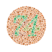
 If you are designing, or re-designing your web site, it is time well spent running your website through the color accessibility tools below to ensure that your site can be seen correctly by as many people as possible. Most of these tools use WC3 guidelines to perform their various operations. If you can actually read and understand them, the Web Content Accessibility Guidelines (WCAG) 2.0 requires, amongst other things, that there is sufficient contrast between text and background color. For a person with a color disability, the colors used on a web site can mean the difference between being able to read text and images or not. 1 in 12 people have some sort of color deficiency.
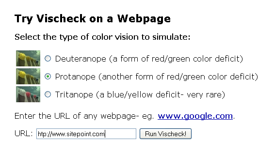
Vischeck allows you to see your website or an image, as a person with color disabilities would see it.
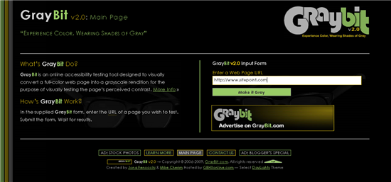
 The Gray Bit web site comes with the tagline, “Experience Color, Wearing Shades of Gray”. That’s exactly what this tool does. You submit your URL on the homepage and Gray Bit converts you colorful web-page into a grayscale version so that you can test the contrast on the page.
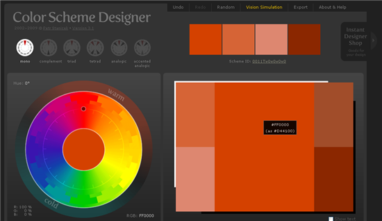
 Colour Scheme Designer. In the image below, the blocks of color in the bottom right show how red looks to people with Deuteranomaly, which is the most common form of color blindness affecting 5% of men and about 0.4% of women. You can choose a vision simulation which shows you how
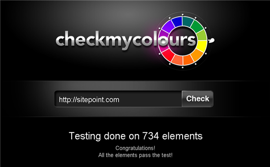
 The Check My Colors web site provides a simple form on which to submit your URL. It then checks all of the elements on your page against the W3C’s guidelines on color brightness and luminosity on web sites.
 And finally, there’s Hue Vue, which is not so much a tool for web designers, as a tool for color blind people. This is an iPhone application and color tool designed to help people with color vision deficiencies to identify, match and coordinate colors. Necessity is the mother of invention as they say, and this app was created by a color blind person who needed a tool to help him discern which color he was looking at. He once had the problem of buying a pink phone for his son by accident, when it should have been grey!
These are just five of many color accessibility tools available. Which tools are you using for testing colors?
Frequently Asked Questions (FAQs) about Color Accessibility Tools
What is color accessibility and why is it important in web design?
Color accessibility refers to the design practice of ensuring that the color scheme of a website or digital product is easily perceivable and understandable by all users, including those with color vision deficiencies or other visual impairments. It is a crucial aspect of inclusive design, as it ensures that digital content is accessible to a wider audience. This includes people with color blindness, low vision, and age-related vision impairments. By considering color accessibility, designers can create websites that are not only more user-friendly but also compliant with accessibility standards and regulations.
How can I check the color contrast on my website?
There are several online tools available that can help you check the color contrast on your website. These tools allow you to input your foreground and background colors, and then they calculate the contrast ratio between these colors. Some of these tools include WebAIM’s Contrast Checker, Accessible Web’s Color Contrast Checker, and Coolors’ Contrast Checker. These tools are easy to use and can help you ensure that your website meets the minimum contrast requirements set by the Web Content Accessibility Guidelines (WCAG).
What is the WCAG and what does it say about color contrast?
The Web Content Accessibility Guidelines (WCAG) is a set of recommendations for making web content more accessible to people with disabilities. According to the WCAG, the minimum contrast ratio between text and its background should be 4.5:1 for normal text and 3:1 for large text. This ensures that the text is easily readable by people with color vision deficiencies.
What are web colors and how do they affect color accessibility?
Web colors are colors used in displaying web pages, and they are specified as RGB values, hexadecimal codes, or by their common names. The choice of web colors can significantly affect color accessibility. For instance, using colors that are too similar can make it difficult for people with color vision deficiencies to distinguish between different elements on a page. Therefore, it’s important to choose colors that provide sufficient contrast.
How can I choose an accessible color palette for my website?
Choosing an accessible color palette involves considering the color perception of all users, including those with visual impairments. You can start by using online tools that generate color palettes based on WCAG guidelines. These tools can help you create a color scheme that provides sufficient contrast between different elements on your website. Additionally, you should also consider using patterns, textures, or different shapes to distinguish between elements, as relying solely on color can exclude users with color vision deficiencies.
What is color blindness and how does it affect web accessibility?
Color blindness is a type of color vision deficiency where individuals cannot distinguish between certain colors. This can make it difficult for them to navigate websites that rely heavily on color to convey information or distinguish between different elements. Therefore, when designing a website, it’s important to ensure that information is not conveyed by color alone and that there is sufficient contrast between different elements.
How can I make my website more accessible to people with low vision?
Making your website more accessible to people with low vision involves ensuring that your text is easily readable and that there is sufficient contrast between your text and its background. You can also provide options for users to adjust the text size and the contrast of your website. Additionally, you should ensure that your website is navigable using keyboard commands, as some users with low vision may rely on screen readers or other assistive technologies.
What are some common mistakes to avoid when designing for color accessibility?
Some common mistakes to avoid when designing for color accessibility include relying solely on color to convey information, using colors that are too similar, and not providing sufficient contrast between text and its background. Additionally, not providing options for users to adjust the text size and contrast can also make your website less accessible.
Can I use color accessibility tools to check the accessibility of my mobile app?
Yes, color accessibility tools can also be used to check the accessibility of mobile apps. These tools can help you ensure that your app meets the minimum contrast requirements and that your color scheme is easily perceivable and understandable by all users, including those with color vision deficiencies.
How can I learn more about color accessibility and inclusive design?
There are many resources available online that can help you learn more about color accessibility and inclusive design. Websites like WebAIM, W3C, and Accessible Web provide a wealth of information on these topics. Additionally, there are also many online courses and tutorials that can help you develop your skills in these areas.
Jennifer Farley is a designer, illustrator and design instructor based in Ireland. She writes about design and illustration on her blog at Laughing Lion Design.

